Guide · The Donut Agency
Size Matters (When It Comes To Your List)
Every dollar email and SMS produce scales with the size of your list. The biggest single source of new subscribers is your popup, which is also the most hated object on your storefront.
This is how you get a stranger to hand over an address anyway, in the order that actually decides the result: the offer first, the mechanics second, the design last.
Every popup shown here is a screenshot of a live storefront, captured in August 2026. Multi-step sequences were walked through in order, so the steps shown are the steps a first-time visitor gets.
Section 1
Your list size is the ceiling on everything downstream
The bigger your list, the more revenue you can drive by sending emails and text messages. Flows, segments and campaigns all divide the same pool of people. If that pool stops growing, every tactic downstream is fighting over a fixed number of inboxes.
On almost every store, the biggest single source of those addresses is the popup. That annoying thing that shows up to interrupt your browsing experience. Every human hates popups, unanimously. Somebody lands on your site to check the fabric weight on a hoodie, and three seconds later a box covers the screen and they go hunting for the close button.
Look at what you are asking that person for. An inbox holds their tax documents, their receipts, and notes from their family. A phone number is direct access to the device in their pocket. You are asking an annoyed stranger to hand you the most private thing they own, one second after you got in their way, through the exact object that annoyed them.
Two of the ten storefronts reviewed for this guide were running nothing on the homepage at all. Both are nine-figure brands.
Section 2
Three levers, and almost everyone pulls them backwards
Three things decide how many addresses a popup collects. They are not worth the same amount, and the order matters more than any individual tactic inside them.
| # | Lever | What it covers | Cost to test |
|---|---|---|---|
| 1 | The offer | What they get for the address | Margin |
| 2 | Interaction mechanics | How they move through the box: steps, questions, what unlocks what | Nothing |
| 3 | Copy and design | Size, layout, imagery, wording | Nothing |
The offer decides most of it. With a strong welcome offer, people will give you their email address, their phone number, and their credit card. With a weak one, no layout change rescues you.
Sign-up rate comes in low, so the team reaches for a spin-to-win wheel, or a quiz to collect zero-party data, or a low-friction question to buy a micro-commitment. Calm down, Cialdini. Those are lever two and lever three moves, and they are being used to rescue a lever one problem. Build the offer, then the mechanics, then the framework that tells you which change did what.
Section 3
Lever one: the offer
A good offer costs you very little and still lands as “wow, I am getting a great deal”. The gap between those two numbers, what it is worth in their head and what it actually costs you, is perceived value arbitrage. Every decision in this section is an attempt to widen that gap.
3.1 A big discount is not automatically a good offer
Start with 80% off. Your customers would love it. You would acquire far more customers than your competitors, your sign-up rate would beat every brand in your category, and you would lose money on every single order until there was no business left. So was 80% off a good offer? It was not.
Why discount depth is the weakest lever with the biggest bill
A dollar off costs you exactly one dollar. There is no gap to work with, no manufacturing leverage, nothing between what they perceive and what you pay.
3.2 Free product costs you less than the discount it replaces
The widest gap you can usually buy is free product. When I worked at Hush, the best offer we ever unlocked was a free pillow with the purchase of a blanket. It crushed our 20% off offer.
| 20% off a $300 blanket | Free pillow with the blanket | |
|---|---|---|
| What they get | $60 off | a $120 pillow |
| What it costs the brand | $60 | well under $60 |
The discount is a straight swap. Sixty dollars of savings for them, sixty dollars of gross profit out of the brand. The pillow retailed at $120 and cost Hush a lot less than the discount did. I cannot publish internal pricing, but the direction is the whole point: the customer gained more and the brand lost less.
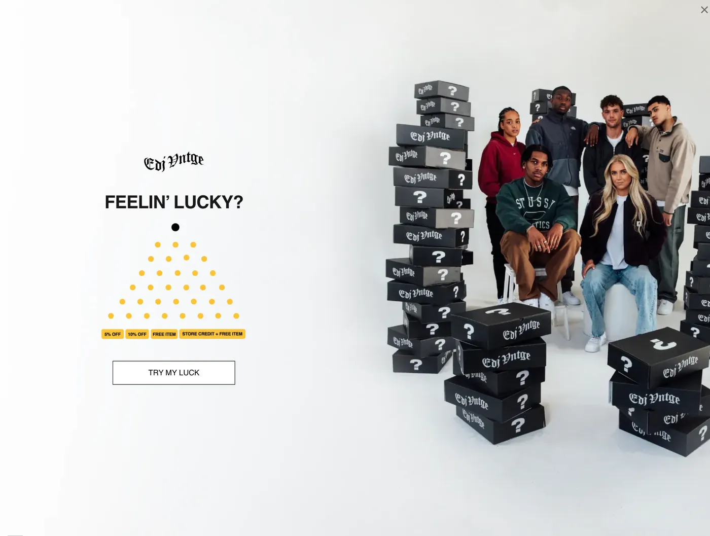
That only works because the perceived value is real. People wanted that pillow on its own and knew what it sold for, the same way EDJ’s audience knows what a Carhartt piece costs. You cannot tack on some cookies, hey my mom made these, best cookies in the world, priceless if you ask me. Nobody is going to ask you. It is the internet, and if you have read a TikTok comment section lately, people are brutal and they hate your mom’s cookies.
3.3 Put a floor under the discount
Not every catalogue has a giveaway product worth wanting. The next move is bundling, or pack-based discounting, or the simplest version of it: a spend threshold.
Big discounts are more enticing, and you do not want to hand one to a small order. So attach a floor. You want 20% off, go ahead, you have to spend at least $200 with us. That immediately puts people into girl math mode, and it is not only girls who do girl math, I do it constantly. 20% off but I have to spend $200. Am I spending $200 or saving $40?
The floor does two jobs. It keeps you from paying depth on a single-item cart that was going to convert anyway, and it gives them a reason to add the second item to clear the threshold. The discount rate on the popup can be higher than you would otherwise risk, because you decided which orders it applies to.
Worth noticing
Not one of the six popups captured for this guide puts a floor under its offer. Every one of them is sitewide and unconditional, which is the cheapest thing on this list to go and change.
3.4 Give credit instead of a discount
The third offer type is credit or cashback. Do not give them $20 off. Give them $20 back for their next purchase. To them it is $20 of value either way. To you it is not.
Say that $20 buys an extra pair of socks, and that pair costs $4 to make and ship. Congratulations, you took a $4 hit and your customer thinks the socks cost $20. That $16 difference is the perceived value arbitrage, in the plainest form it comes in.
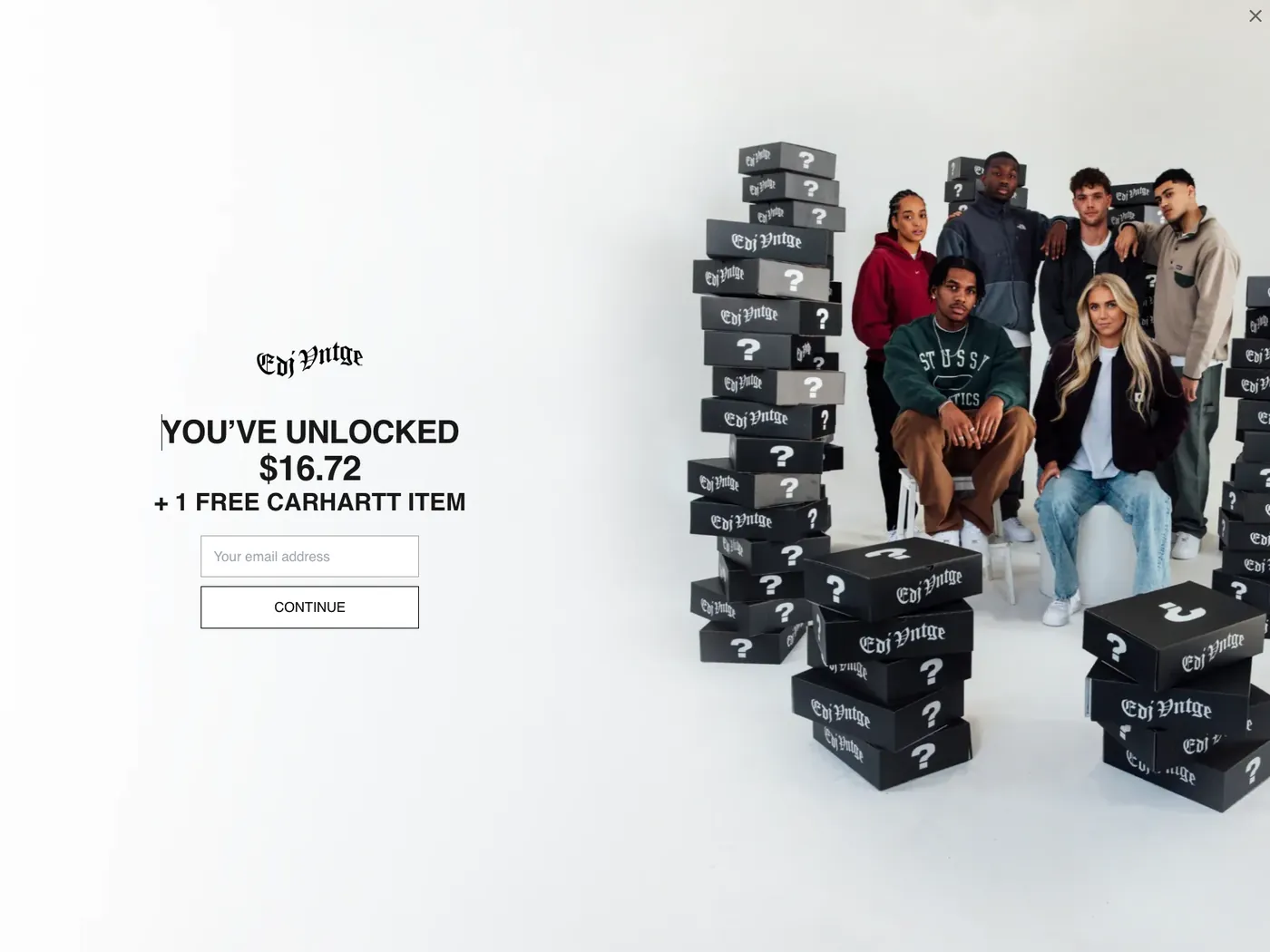
Twenty dollars off today is margin surrendered on order one with nothing attached to it. Twenty dollars in credit sits in the account until they come back and cover the rest themselves. True Classic runs the same idea on their live popup, offering up to 20% back as store credit rather than off the order.
Section 4
Lever two: interaction mechanics
Interaction mechanics are everything about how somebody moves through the box. The simplest version is one screen: enter your email, unlock a discount. Everything else is a variation on where you put the steps.
4.1 Make the first screen an action, not a form
Add a step before the field and ask for something that costs nothing. The plainest version is a yes or no question, “want 10% off?”, and the same offer gets a different answer once they have said yes to it. They act consistently with a decision they just made. Present that offer cold and they close the box. Thankless people.
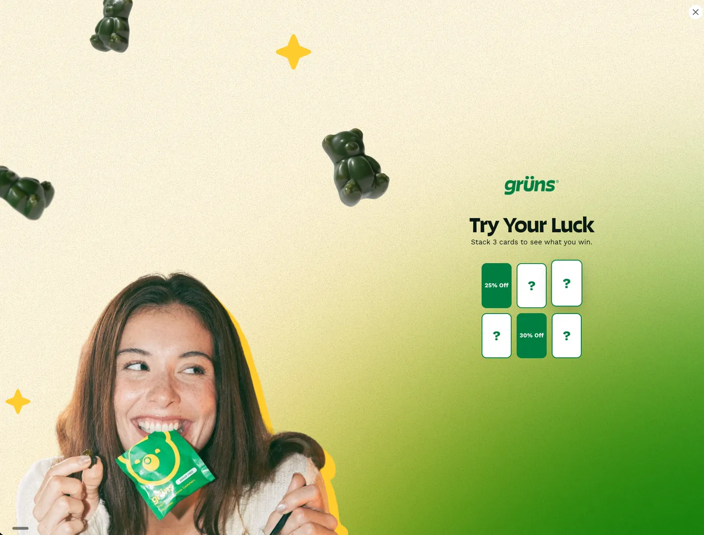
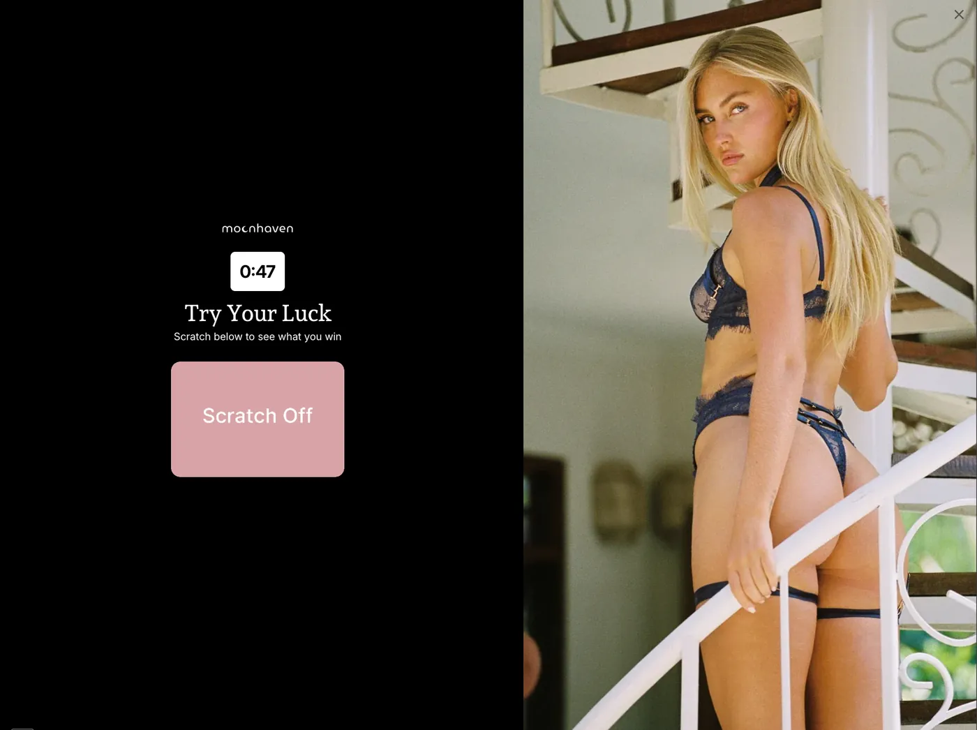
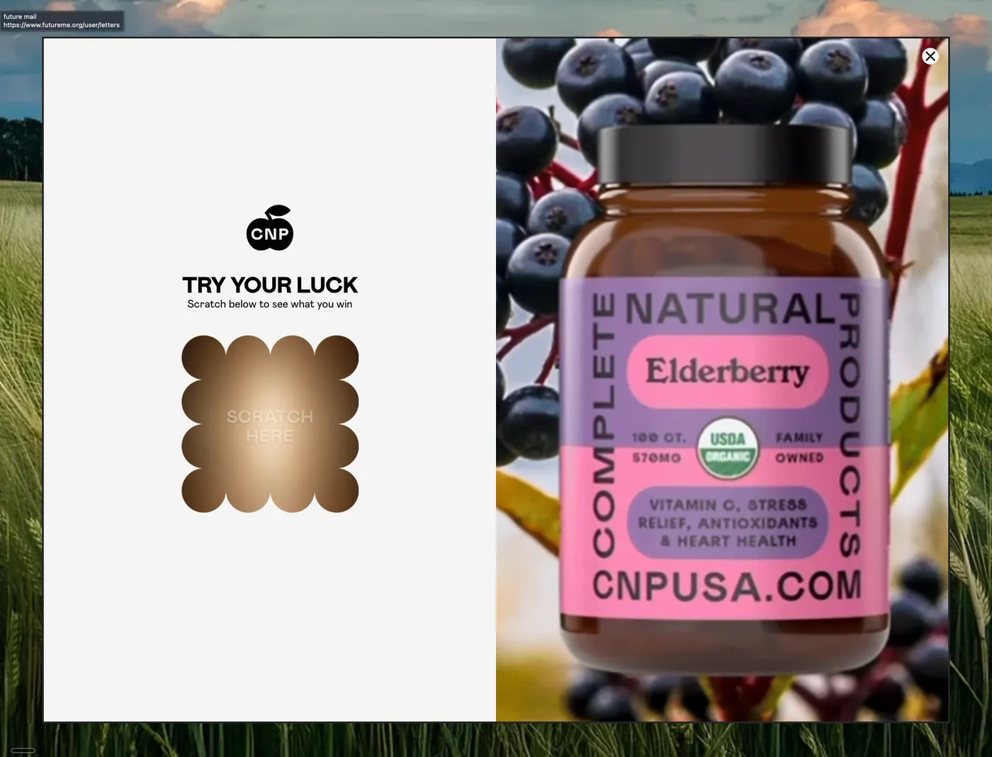
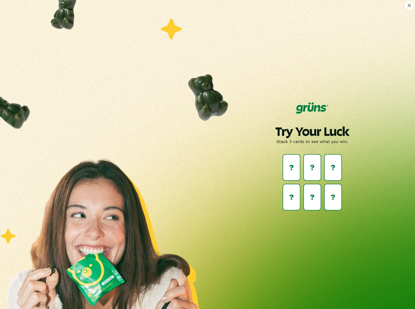
A game does the same job with more theatre. Scratch a panel, stack three cards, drop a chip. Three of the six brands captured open this way.
4.2 Ask the question the discount pays for
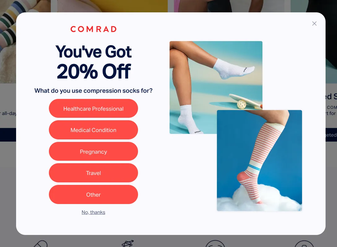
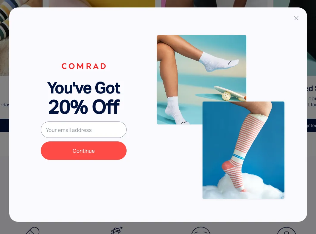
Use that first step to learn something instead. Ideally the main reason they are buying what you sell. Are they after more focus, or are they trying to calm their anxiety? Or something as blunt as shirts or jeans, or shopping for men or women. The discount is what buys an answer nobody would give a form.
Questions that sort people into buckets you can actually merchandise against:
| Vertical | Question | Buckets |
|---|---|---|
| Beauty | What are you shopping for? | Complexion / Skincare / Eye / Lip |
| Supplements | What are you trying to solve? | Energy / Gut / Nutrition / GLP-1 support |
| Collagen | What's your goal? | Beauty / Fitness / Anti-aging |
| Apparel | What matters most? | Fit / Style / Comfort |
| Baby | How old is your little one? | Age ranges |
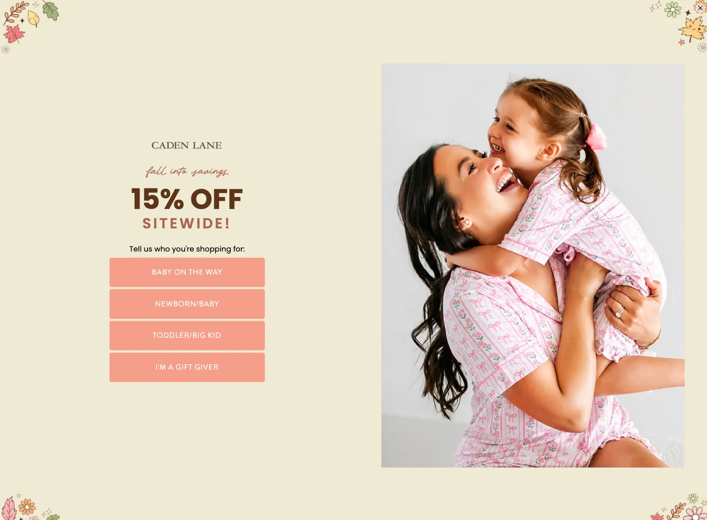
- Four or five choices. Caden Lane runs four, Comrad runs five. Past that they scan the list instead of reading it.
- Give them a way out. “Not sure”, “All of the above”, “Nothing yet”. Without one you force a false answer and corrupt the segment you built the question for.
- Use their words. Comrad asks what you use compression socks for and answers it with Healthcare Professional, Medical Condition, Pregnancy, Travel. Those are reasons. Category labels only work when the categories match how people shop.
- Open easy. On a multi-step popup the first question should take no thought at all. The hard one goes later.
4.3 Charge separately for the phone number
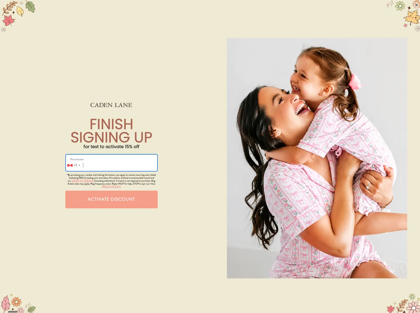
SMS earns more per subscriber than email on most catalogues and it is harder to capture. The failure repeats: they submit an email, the code appears, and the box gets closed before the phone field is ever looked at. Put extra value behind the second step, either more depth on top or one code that only unlocks once both have been given.
4.4 Caden Lane asks three times before it asks for an address
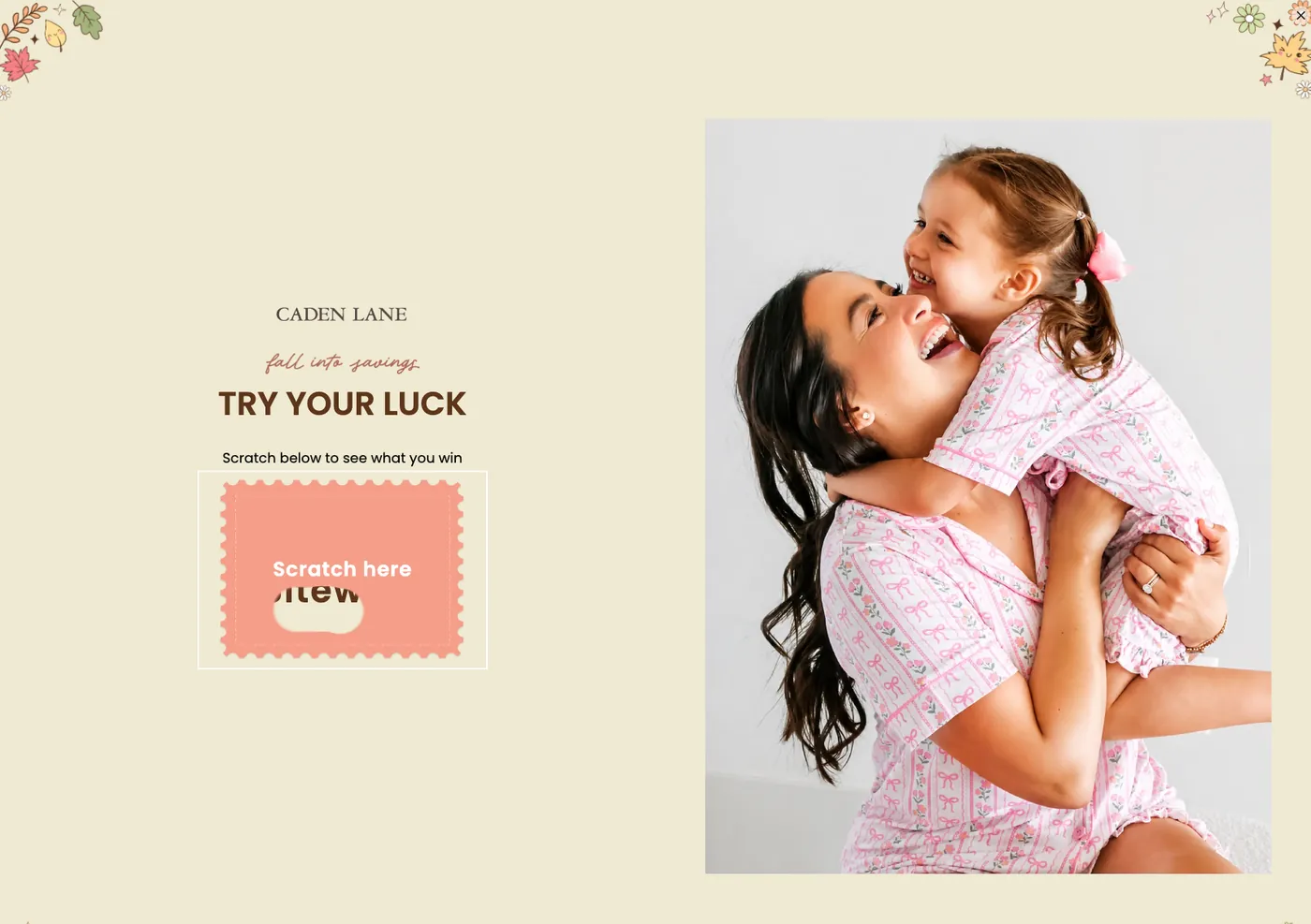
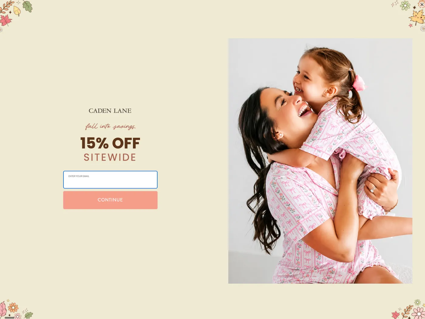
Caden Lane runs four screens. Nobody is asked for an address until they have already scratched a card and answered a question, and the phone number is asked for last, behind its own reason.
Step 1 · the game
Step 2 · the question
Step 3 · the address
Step 4 · the number
Section 5
Lever three: copy and design
Once the offer and the mechanics are settled, start testing copy and design. Should the popup take up the whole screen? Should it carry a lifestyle photo or a product photo? Should it say “save 10%” or “get 10% off”? Each one plays a small role on its own. Stacked, they can double or triple the number of addresses you collect.
| Element | Impact | Note |
|---|---|---|
| Full-page takeover against mid-size modal | High | Your biggest design variable |
| Image present against text only | Moderate | Test it before assuming the image earns its space |
| Image as side panel against background | Moderate | Side panel dominates the field capture |
| Field count | Moderate | Every extra field costs completions |
| Which image | Low | Rarely worth a test cycle of its own |
| Power words in the headline | Low | Weak effect |
Five of the six popups in this guide are full-page takeovers with the offer on one side and a photograph on the other. Comrad is the only centred modal. These are brands with enough traffic to have tested the question, and they mostly landed in the same place.
Timing sits in this tier too. A well-built popup shown at the wrong moment loses to a mediocre one shown at the right one.
| Setting | Start here | Then test |
|---|---|---|
| Display trigger | 10 seconds or 30% scroll depth | Shorter delay, deeper scroll, exit intent |
| Audience | New and non-returning visitors | Returning non-purchasers as their own campaign |
| Mobile | Its own design | Trigger timing independent of desktop |
| Geography | One global popup | Region-specific framing for shipping and tariffs |
Easy to miss in an audit
An identical popup on mobile and desktop is a defect, not a simplification. When both viewports render the same layout, write it up as a finding.
This tier is where most teams spend every test cycle they have, arguing about button colour and a five-word headline, while the offer that nobody wanted sits untouched for two years.
Section 6
The testing framework
Popups have to be tested non-stop. The reason to have a framework before you start is that the order decides whether any of the results mean anything.
6.1 Order of operations
Offer, then mechanics, then copy and design. Changing a button from green to orange on an offer nobody wants tells you nothing you can use. Settle lever one, lock it, then move down.
6.2 Judge on what the list is worth
Your platform shows you sign-up rate first, so that is the number people optimise. Follow it on its own and the logical end point is 80% off, because that popup wins on sign-up rate right up until the business is gone. Games do a quieter version of the same thing: scratch-offs and card stacks lift sign-ups because playing is fun whether or not you intend to buy, and the cost shows up later as a worse welcome-flow conversion rate and a heavier unengaged tail.
6.3 One variable at a time, cheapest first
Order the tests by what they cost you, not by what you expect them to return.
| # | Test | What it costs |
|---|---|---|
| 1 | Whether a popup is live at all, on both viewports | Nothing |
| 2 | Takeover against mid-size modal | Nothing |
| 3 | Micro-yes sequence against a single form | Nothing |
| 4 | Adding the question step | Nothing |
| 5 | Adding exit intent as a second surface | Nothing |
| 6 | Offer format: free gift, spend threshold, store credit, straight discount | Low |
| 7 | Game mechanic against plain capture | Lead quality |
| 8 | Offer depth | Margin |
Only the last two carry a real bill, and they are the two most teams reach for first. Rewrite the headline, change the layout and swap the offer in the same week and you will never know which one moved the number.
6.4 Five more places to capture an address
- Exit intent, running its own offer rather than repeating the entry popup
- Winback, aimed at returning visitors who have not purchased in a year, with a deeper offer
- Embedded forms in the footer, on back-in-stock, and on landing pages
- Quizzes, which go deeper on zero-party data than any popup can
- Partnerships and giveaways with brands that share your customer
Consent risk
Identity-resolution tools resolve anonymous traffic to email addresses and then market to people who never opted in. That is a consent and deliverability exposure. When one turns up in an audit, write it up as a finding rather than a growth channel.
The bucket, the channel and the source you capture at opt-in are the raw material for every segment you will ever build. Grow a list without asking a single question and you have bought yourself an audience you can only send one message to.
Want this run on your account instead?
Get a free Klaviyo audit. We pull your numbers and show you exactly where the revenue is leaking.
Get the free audit